When first announced back in February, speculation as to the impact of the new Mobile-Friendly Algorithm was at an all-time high.
Fast forward a month or so, and Gary Illyes, a webmaster trends analyst at Google, has confirmed that the new Mobile-Friendly Algorithm has now been fully rolled out, but with a caveat. It will only take effect once Google has recrawled the pages, so for some larger websites, that could take weeks or even months to complete.
Furthermore, Gary indicated that the significant effect on the SERP’s that was expected has largely been mitigated by the fact that many websites have recently made the jump to becoming mobile-friendly.
@rustybrick Also, there were a load of sites that became MF recently, so the actual number of sites affected decreased considerably
— Gary 鯨理/경리 Illyes (so official, trust me) (@methode) May 1, 2015
Indeed, many of the SERP trackers do not yet track mobile search fluctuations. Still, one of the ones that do (Rank Risk Index) shows that the update may have rolled out a few days earlier than the 21st April, with significant fluctuations seen from about the 15th April:
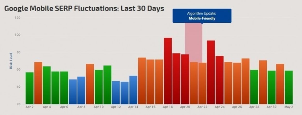
Not seeing anything here in the UK. Didn’t deserve its title of Mobilegeddon in all honesty.
That being said, many in the SEO community are not seeing any notable changes within the Mobile Search results. Perhaps the impact of the new update was vastly overstated, or maybe less non-mobile-friendly websites are ranking highly in the search than we thought.
Indeed, in the lead up to the 21st April Google announced that 4.7 percent more mobile-friendly websites featured in the SERP’s and we suspect in the two weeks since then this has only increased further.
What is a Mobile Friendly website?
It is probably worth clarifying what we mean by a “mobile-friendly” website for the benefit of those that are hearing about this new algorithm for the first time.
A mobile-friendly site adheres to the following basic principles:
- Avoids software like Flash that is not common on Mobile Devices
- You can read the text on the webpage without having to zoom in.
- The content is the correct size for the mobile device so that users do not have to scroll horizontally or zoom in.
- The links are set out in such a way that they can be easily pressed on a mobile screen.
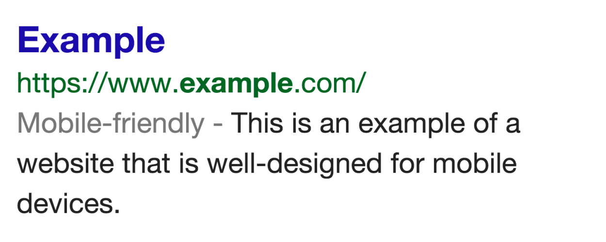
If your website is Mobile Friendly, when you see it in the SERP’s you will see a “Mobile-friendly” badge as shown below:
How big will the update be?
Google’s Zineb Ait Bahajji, a Webmaster Trends Analyst, said at SMX Munich earlier in March that the mobile search update will have a more significant effect than Penguin and Panda!
Zineb from Google at #smx Munich about the mobile ranking update: is going to have a bigger effect than penguin and panda!
— Aleyda Solis 🇺🇦 (@aleyda) March 17, 2015
To understand that, we need to look back at how big the recent Penguin and Panda updates were, which is about 4 percent and 12 percent, respectively (stats via Seroundtable).
We then have to consider that mobile searches only make up around 50 percent of all Google searches and that this update is specific to those mobile searches. Therefore, for the mobile search algorithm to be bigger than either Penguin or Panda, we must be looking at some very significant movement indeed.
But not everyone is convinced. Rand Fishkin (from Moz) had this to say in response to Zinebs statement:
my skepticism is at an all-time high :-)
More about Google’s Mobile-friendly Update
This is a topic that has been rumbling on for a few weeks now.
First, we had the announcement on the Google Blog that from the 21st April 2015, there will be a Google update that will seek to use mobile-friendly factors as a ranking signal.
Then we had John Mueller mention on a Google+ hangout various factors relating to mobile search.
Finally, we had the announcement at #smx by Zineb from Google that the mobile ranking update is going to have a more significant effect than Penguin and Panda!
So let’s start at the beginning and flesh out some of the detail.
Google’s Initial Announcement
On 26th February 2015, Google released a blog post titled “Finding more mobile-friendly search results.” The intent was clear, … to signal to the webmaster community that from 21st April 2015, they will be using mobile-friendliness as a ranking signal. They said:
This change will affect mobile searches in all languages worldwide and will have a significant impact on our search results. Consequently, users will find it easier to get relevant, high-quality search results that are optimized for their devices.
The purpose of the blog post was to both bring the change to webmasters’ attention and to point people in the right direction on how to test their website for “mobile-friendliness” as well how to check their Webmaster Tools “mobile-friendly " report. Let us look at each in turn:
Mobile-Friendly Test
Thankfully, Google has a mobile testing tool (click to visit) that will enable you to check whether Google considers your webpage to be mobile-friendly. All you need to do is enter your URL and click “Analyze.” Within 20-30 seconds, you will get the verdict back, which is, in our case, “Awesome! This page is mobile-friendly.”
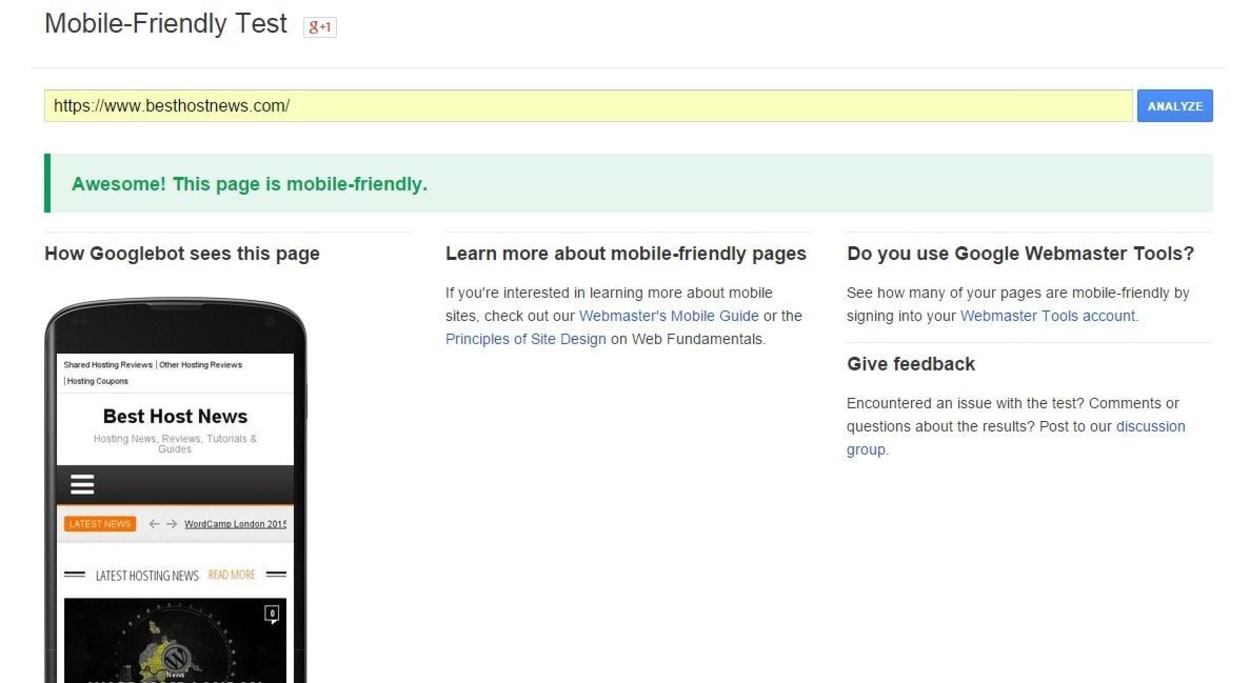
But it gets better. Google has produced a whole website guide that you can work through here. This contains lots of helpful information and advice, from working with various content management systems, to SEO considerations when implementing your mobile strategy.
Mobile Usability Report
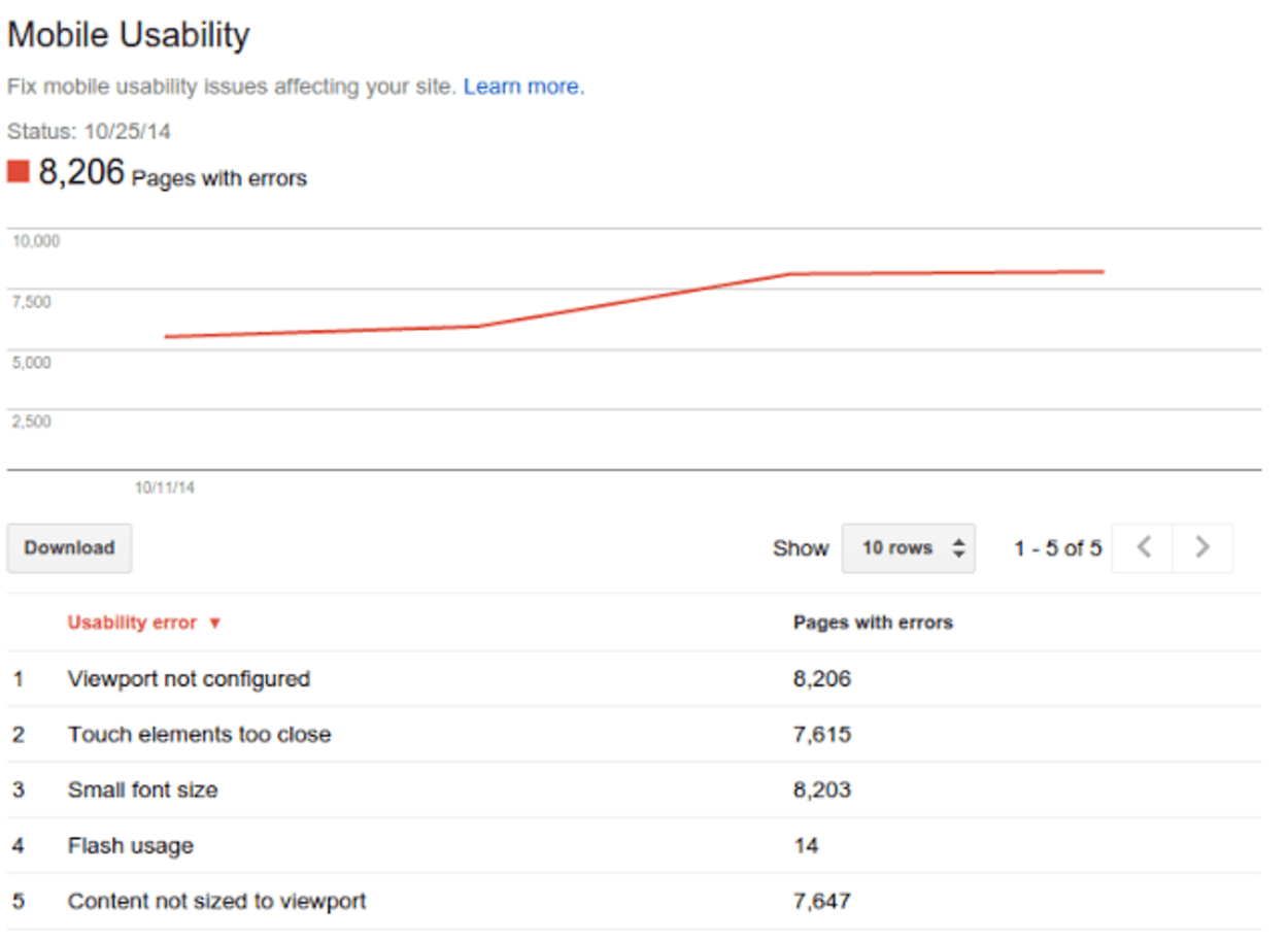
Another thing to keep an eye on is the Mobile Usability Report within your Webmaster Tools admin area. This will let you know specific things wrong with your website so that you can go away and fix them. Examples of such errors might be (click links for further information on each error):
- Viewport not configured
- Touch elements too close
- Small font size
- Flash usage
- Content not sized to viewport
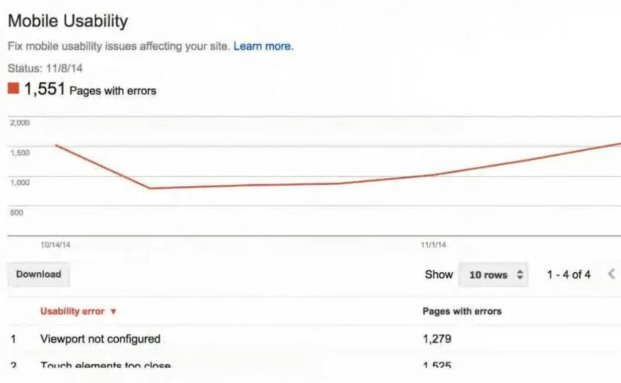
As you can see, with the report being so specific, the issues should be easy to rectify. An example report is shown below:
As you can see, Google has produced quite a few resources to assist webmasters in getting their websites up to scratch. Furthermore, they have specifically announced a date for implementation of this algorithm change to give webmasters plenty of time to implement any necessary changes.
John Mueller Google Webmaster Central Hangout
The full transcript of the relevant part of the video is below (including slides):
To start off with, one thing we announced yesterday was that we’re going to start using mobile-friendliness as a ranking factor. So if you have a mobile-friendly page, mobile-friendly site, or if you have an app associated with your website through app indexing, then that’s something that we’re going to reflect in the search results for smartphone users. So to kind of just very, very briefly go through what it is that we do there, I put together a short presentation. I’ll just go through it very quickly. If you want more information, maybe it’s a good idea to look at the YouTube video afterward, and you can just pause and look at what I have on the slides. But I’ll try to run through it fairly quickly so that we have enough time for all of the questions.
So let me see. All right. I think that’s presenting.
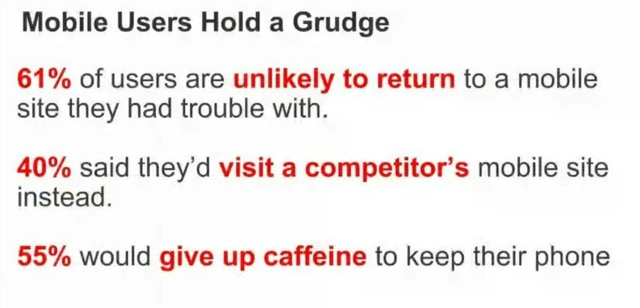
So essentially, we’ve seen lots of users love their smartphone. They use them all the time, and they’re unhappy with some of the non-mobile friendly search results. So some people would even go so far as to give up caffeine. I don’t know. That’s kind of harsh.

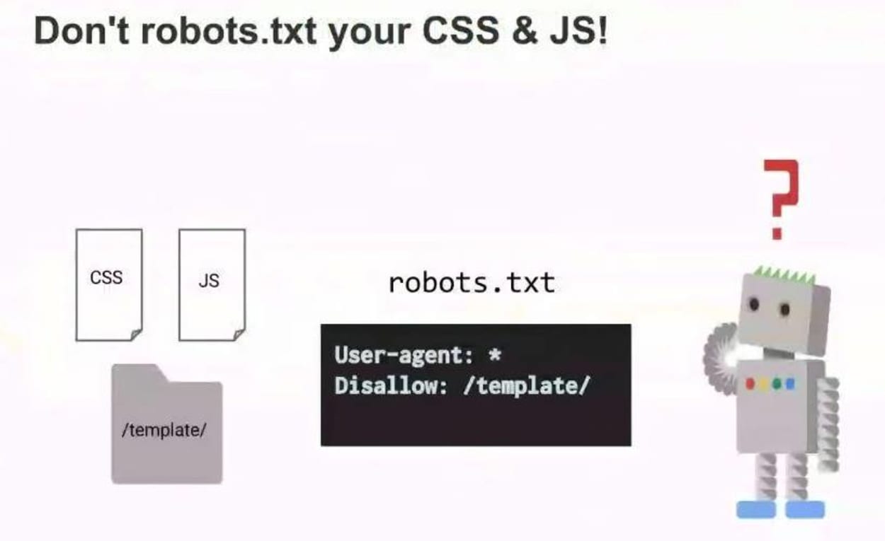
Our main elements that we’re looking at in a very, very simplified way is that if your site is mobile-friendly, we expect that its width matches the mobile device in that to the viewport is properly sized, that the text is visible, that you don’t have to zoom, you don’t have to search for the text on a page, you don’t have the text behind elements like Flash. And from our point of view, since we try to make Google about as smart as a smartphone, but we also have to stick to our traditional guidelines, like the robots.txt, which tells us which parts we can crawl or not, we also have to be able to kind of crawl all of this content, crawl the CSS and JavaScript so that we can see that this is actually a mobile friendly page.
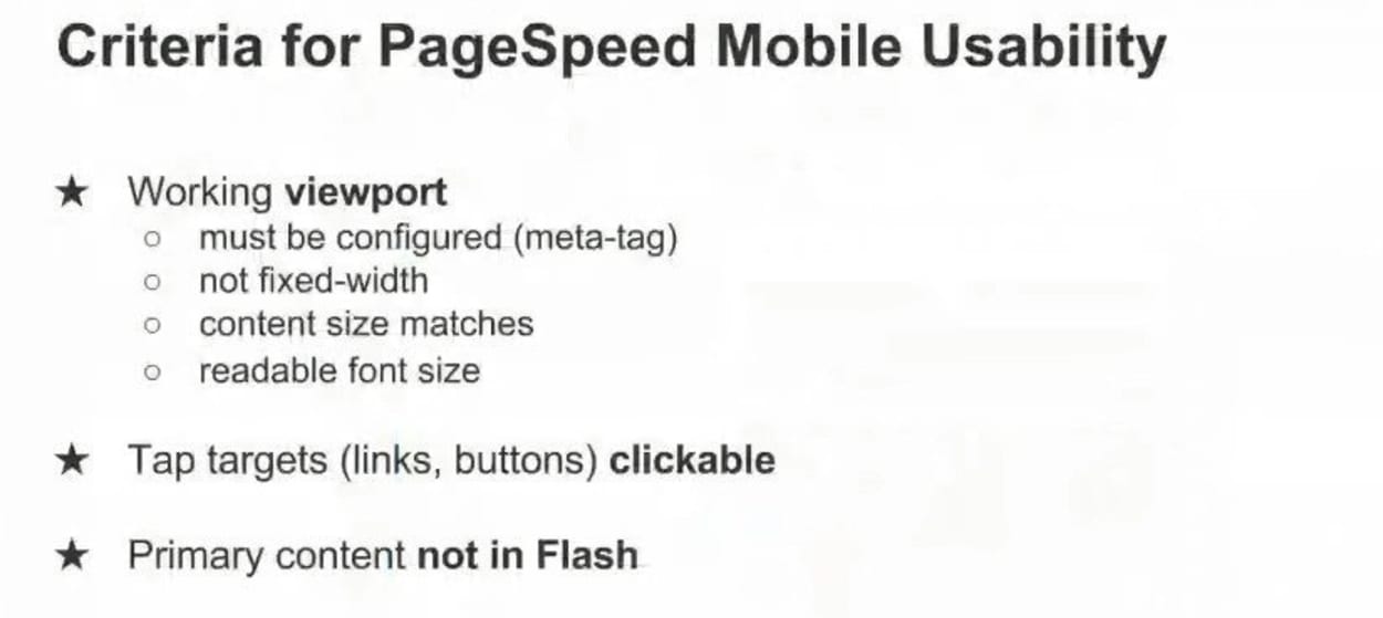
This, very briefly, for the PageSpeed mobile usability guidelines, what we’re looking at at the moment– in general, we have three ways that we recommend of making a mobile friendly website that connects to your desktop site.
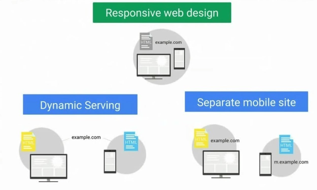
On the one hand, responsive web design is where you have the same website, but it looks differently depending on the device. Dynamic serving is where you’re serving slightly different content, depending on the device, or completely separate mobile site. For example, if you have an old website that you can’t update for technical reasons or for financial reasons for a while, you could set up a parallel version of those pages and just connect those pages on a one by one basis.
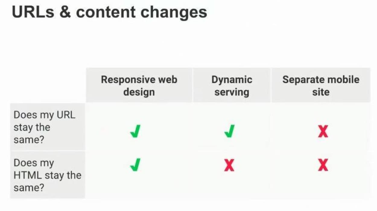
Each of these different options has different ways of handling the URLs, staying HTML or not. From our point of view, they’re essentially equivalent. We don’t treat any of these with any preferential treatment in search, as long as we can tell that they’re mobile friendly, that’s fine.
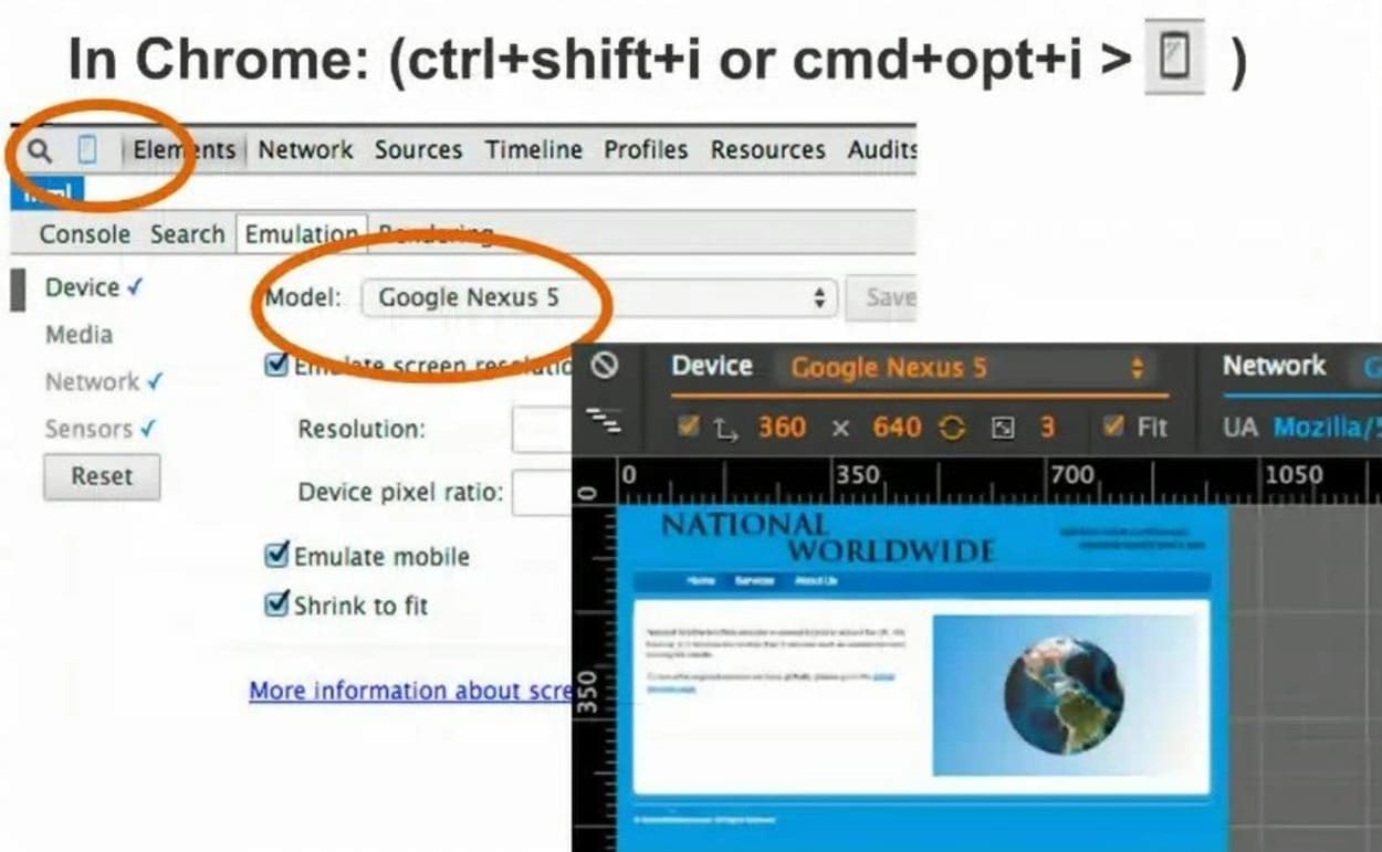
You can check this in Chrome, which is a really easy way to do that if you don’t want to play with your phone all the time. This is a great way to test changes quickly.
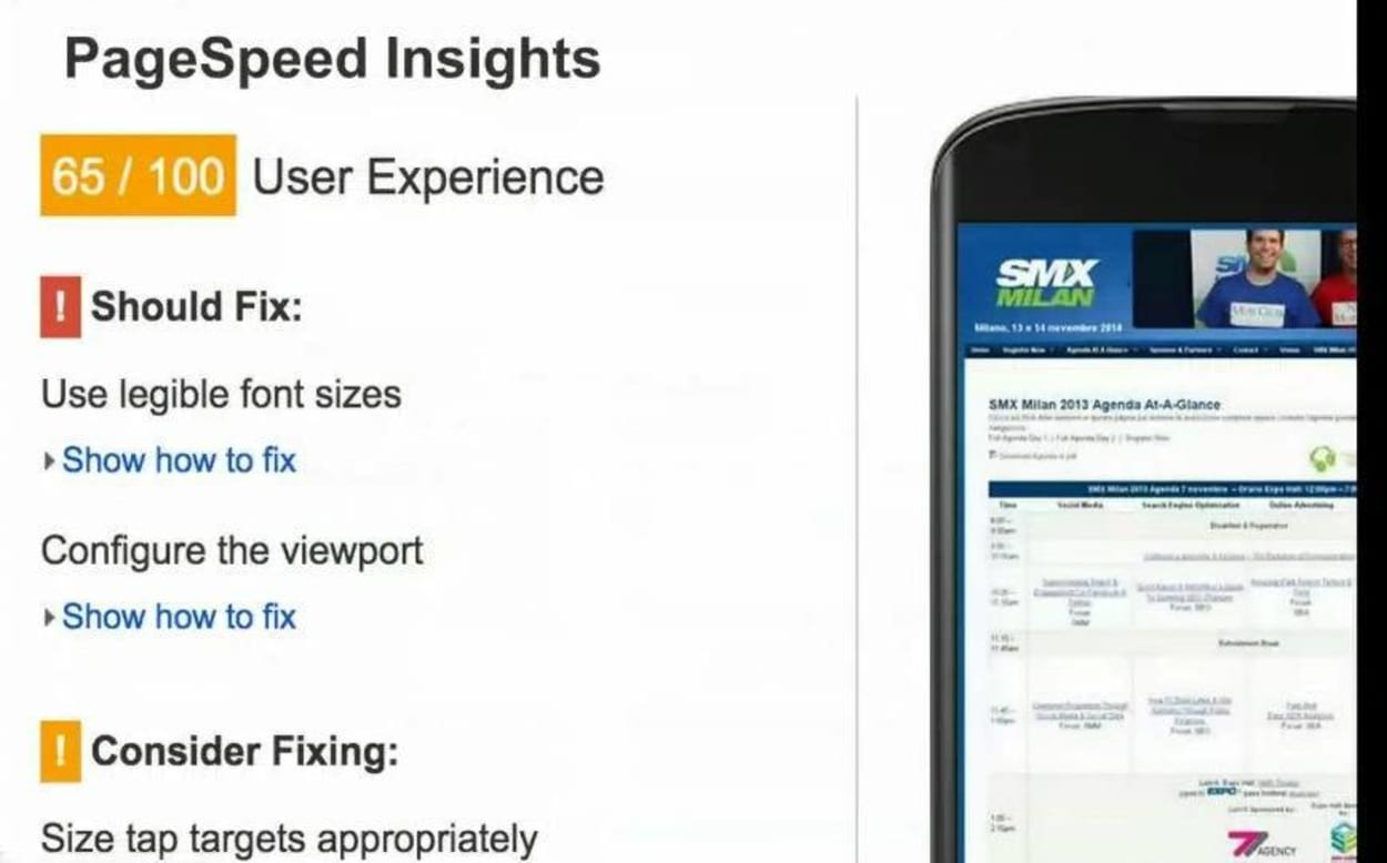
PageSpeed Insights is also a tool that gives you more insight there. Webmaster Tools has some information on how we see the mobile friendly pages.
There’s also, in Webmaster Tools, a mobile usability report, which gives you aggregated information on the mobile friendliness of your site overall, which is really useful, because maybe you’re missing some aspect of your site. Maybe you changed all the templates in your CMS, and you forgot one of them, then this is a great way of finding that.
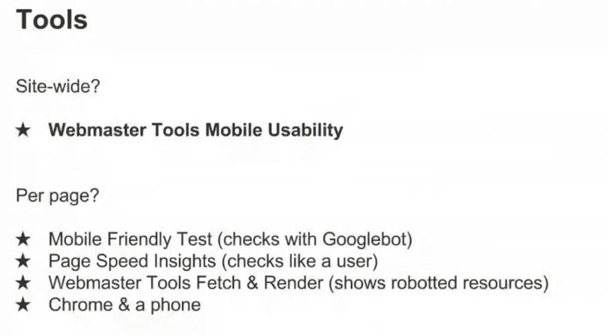
So, again, these are essentially our tools. One thing to keep in mind, the mobile friendly test also uses Googlebot and kind of reacts to the robot.txt guidelines there, so it’s a great way to test if something is blocked.
Fixing a site that has issues with mobile friendliness, if you’re using a common CMS, then often, there are really easy ways to upgrade that. And sometimes you can install a plug-in that just adds a mobile friendly version. Sometimes you can switch to a more modern theme, for example, maybe in WordPress or in Blogger that automatically has a mobile friendly version in it. It kind of depends. But sometimes, if you’re using a common CMS, really easy ways of fixing that.
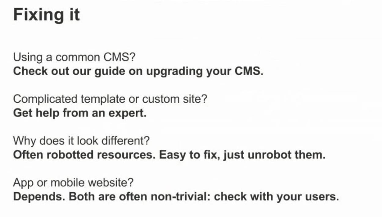
It can be really tricky, though, if you’re trying to modify the HTML yourself, and you don’t really have a lot of experience with HTML, then it’s easy to sink a lot of time into this. So try to get some help from an expert. One common feedback we get is that the pages look different in our testing tool than on a phone. And that’s often due to roboted resources. So for example, the CSS is blocked, then we can’t see what this page might look like.
And finally, some people prefer using apps. I think that’s definitely a respectable choice. Both of them can be nontrivial to implement. Apps can be really hard to implement properly. So this is not a decision that I would make trivially and just say, oh, I’ll just use apps, and that’s fine, because I like apps. Really check with your users to see what they’re comfortable with. Find out where it really makes sense to invest your time, your money, your resources.
I mentioned roboted content a few times. This is really a tricky problem for us, because if we can’t see what this page looks like, we can’t tell that it’s actually mobile friendly, for example.
Interstitials is another big problem for us. If Googlebot crawls a page as a smartphone and essentially just sees a page that says, hey, you should install our app, or you should do this, or you should do something else, and doesn’t see the content, then that’s essentially blocking Googlebot from being able to really properly crawl and render these pages.

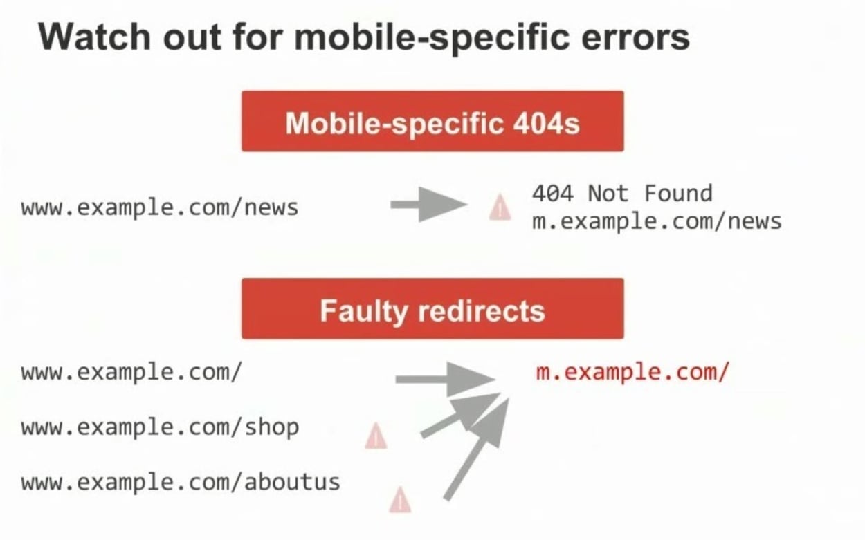
Mobile specific errors are something that we’ve talked about in the past, as well. This has been a ranking factor for quite some time.
Speed is definitely also an aspect that is worth keeping in mind, because depending on how you make your website, this can be quite significant. And on a mobile phone, any additional content that you load, for example, any larger content that you load, takes significantly more time than on a desktop.

